

For the German market, Red&Ko developed the packaging design concept for Dubai Chocolate Style Liqueur under the Boujee brand. The popular combination of chocolate and pistachio needed to be translated from the confectionery category into a premium beverage identity without turning the bottle into an oversized chocolate bar wrapper. A deep blue palette, golden ornaments, and fluid chocolate swirls formed the foundation of the project.
The bottle is tall and narrow, which allows the design to function not as a separate rectangular label, but almost as a continuous vertical composition. The brand name, ingredient imagery, decorative bands, and functional details are distributed along its entire height. The graphics extend onto the shoulders and neck, ensuring the product maintains its recognizability from angles beyond just a frontal view.
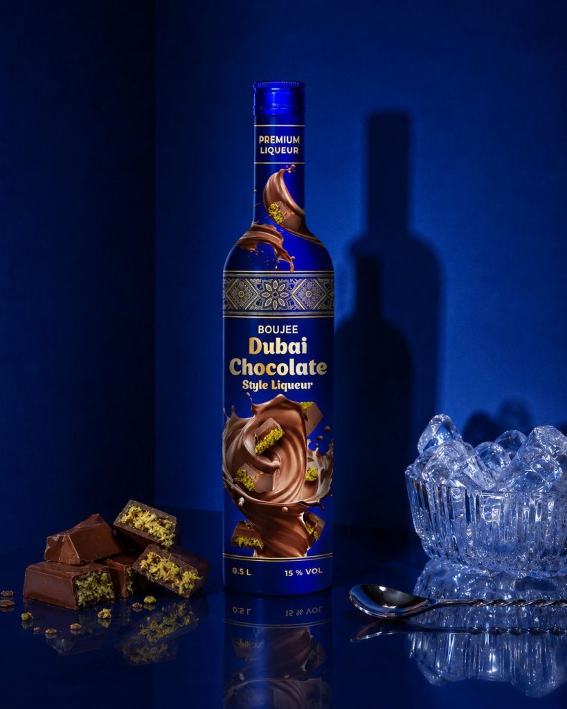
Royal Blue
Deep blue distinguishes Boujee from the usual brown-and-cream palette of chocolate liqueurs. It instantly shifts the perception of the category: the product comes across not as a sweet dessert topping, but as a standalone beverage with a sophisticated evening presentation. Against this backdrop, the gold typography reads clearly, while the warm chocolate shades gain even greater depth.
The blue covers the front panel, neck, shoulders, and lower section of the bottle. The composition does not break apart into several disconnected stickers. A gold frame around the “Premium Liqueur” text, ornamental bands, and the “0.5 L” and “15 % VOL” markings maintain a unified rhythm throughout the entire height.
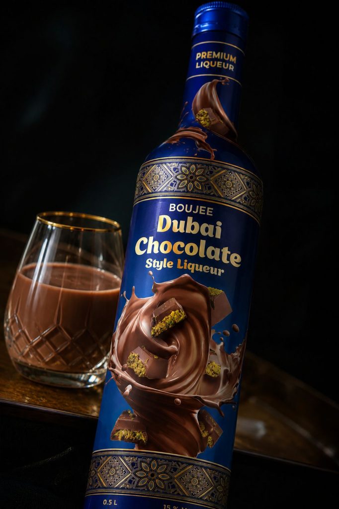
In close-up shots, this color is perceived almost as the surface of the bottle itself rather than a background for an applied artwork layout. This gives the shape a monolithic appearance, which is particularly evident in the frontal product presentation.
What Happens at the Center of the Label
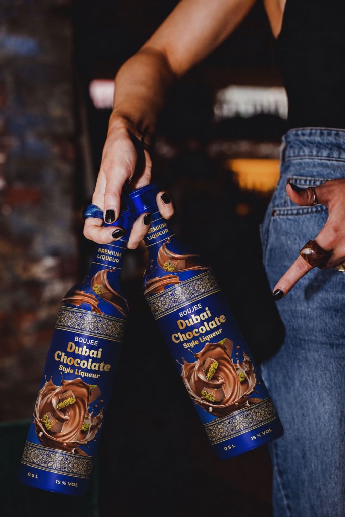
The largest surface area is devoted neither to the logo nor to long descriptive text, but to the chocolate itself. A glossy stream swirls into a wide vortex, running through the lower half of the bottle and partially extending beyond the central field. Splashes and a lighter milk chocolate shade appear alongside it. The image captures richness and fluidity, shaping the flavor profile even before the product name is read.
Embedded within the chocolate mass are pieces featuring a vibrant pistachio filling, establishing a direct link to the Dubai Chocolate trend. The pistachio was not placed into a separate green block or turned into a botanical illustration; it appears inside the chocolate piece—exactly where consumers expect to see the filling.
The title “Boujee Dubai Chocolate Style Liqueur” is positioned above the product artwork. The word “Boujee” is rendered more subtly in a smaller font size, while “Dubai Chocolate” receives the greatest visual weight. The familiar flavor trend is caught first, followed by the specific beverage category below. The “Premium Liqueur” label on the neck acts as an additional indicator, remaining visible even when the main part of the bottle is partially obscured.
The gold typography does not compete with the realistic chocolate imagery. There are no complex drop shadows or excessive decorative flourishes. The contrast arises naturally between the smooth metallic color of the lettering and the soft, glossy mass of the illustration.
For a business planning to order a label design for a product tied to a fast-moving trend, finding the right balance between recognizability and distinctiveness is crucial. The flavor profile is recognized instantly, yet the bottle avoids looking like a confectionery item. The liqueur category is preserved through a clear vertical hierarchy, measured gold accents, bottle geometry, and refined typography placement.
Ornamental Bands
Between the neck and the main field runs a wide decorative band with geometric and floral motifs. A second band is repeated near the bottom of the bottle. They frame the product name and the chocolate scene while separating them from technical information zones.
The ornament does not overwhelm the entire surface. Concentrated into two defined bands, the reference to Eastern luxury remains elegant without being overly literal. The central area retains enough solid blue space for the golden lettering and chocolate artwork to maintain their visual impact.
The Bottle Beyond the Flat Frontal Layout
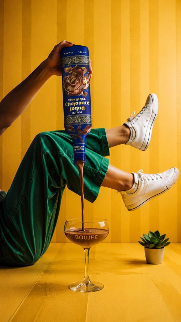
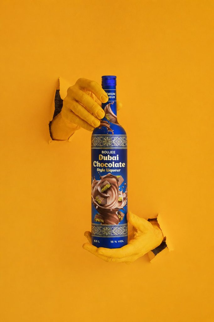
In presentation shots, the bottle is held by the neck, tilted, placed next to a glass, and showcased against a contrasting yellow background. In one setup, the liqueur is poured from an inverted bottle. This presentation serves as an effective test of the composition: key design elements remain recognizable even as the viewing angle changes.
On the slender bottle, the central chocolate swirl is visible from a distance. As the bottle turns, part of the image wraps around to the side surface without losing the essence of the flavor profile. The ornamental bands are similarly independent of a single frontal viewpoint, as they wrap continuously around the bottle.
When a company seeks to order a label design featuring a large hero illustration, a flat layout alone is insufficient for evaluation. A tall bottle tapers toward the neck, distorts graphics on the shoulders, and shifts lettering proportions when tilted. In the Boujee concept, the primary name and crucial imagery were kept within the central working zone. The chocolate graphics on the shoulders act as a continuation of the scene rather than critical information that must be read.
Advertising Presentation
Moody shots with a glass, ice, and chocolate pieces reinforce the image of a premium dessert drink. The bright yellow scenes work differently: they add a sharp, modern contrast, making the blue bottle the primary focal point.
In lifestyle shots featuring hands, the product never becomes secondary prop material. The gold lettering and chocolate core remain prominent, while the elongated bottle shape stays easily recognizable. Even when inverted, the bottle retains its character thanks to the prominent product artwork and repeating decorative bands.
The presentation series does not invent a distinct style for every shot. Certain scenes emphasize a dark bar ambience with cool blue lighting, while others feature a bold, almost poster-like yellow background. The packaging itself stands up to both scenarios without altering its core visual language.
Red&Ko created a cohesive brand image for Boujee where the Dubai Chocolate trend is communicated through its core ingredients rather than a literal copy of confectionery packaging. The blue base, golden typography, ornamental bands, and chocolate with pistachio filling come together into a single vertical design system.
For a company looking to order a label design for a new flavor category, this project illustrates the difference between riding a short-term trend and building a complete product identity. In the finished concept, the liqueur gained its own distinct character, a clear visual hierarchy, and a presentation tailored specifically to the German market.

