

How Donut Berry Gained Its Own Character in a Two-Brand Collaboration Project
Red&Ko developed the packaging for the limited-edition Donut Berry ice cream for the Ukrainian market, created by the “Rud” brand in partnership with the “Simi” retail chain. The product combined a donut shape on a stick, a pink berry shell, colorful sprinkles, and a blueberry-blackberry flavor.
The initial concept was inherently eye-catching, but the packaging needed to quickly explain it to the consumer. A small surface had to accommodate two logos, a new name, flavor description, weight, and a large image of the ice cream. At the same time, the product could not look like a generic line item with a temporary partnership badge added on.
Collaboration Without Fighting for the Top Corner
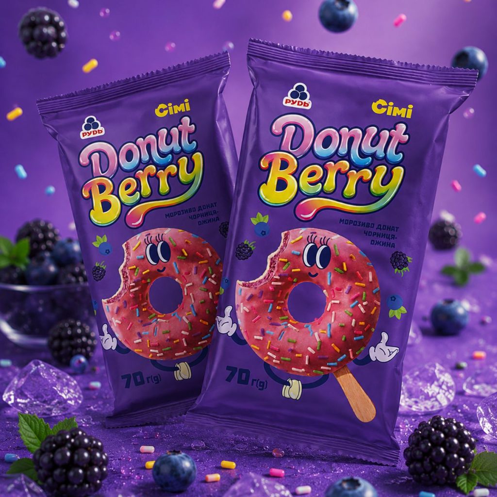
The “Rud” and “Simi” logos sit at the top of the pouch, but there is no visual competition between them. They signal who created the product while yielding the starring role to the Donut Berry title. This approach gave the joint project a distinct identity rather than a composite design cobbled together from two corporate style guides.
The purple background, rainbow typography, and ice cream character do not literally copy either partner’s visual identity. Such independence is particularly appropriate for a limited series. Consumers see a new arrival with its own name and mood, even as both brands remain clearly visible.
Prominent Title, Pink Donut, and the Right Measure of Chaos
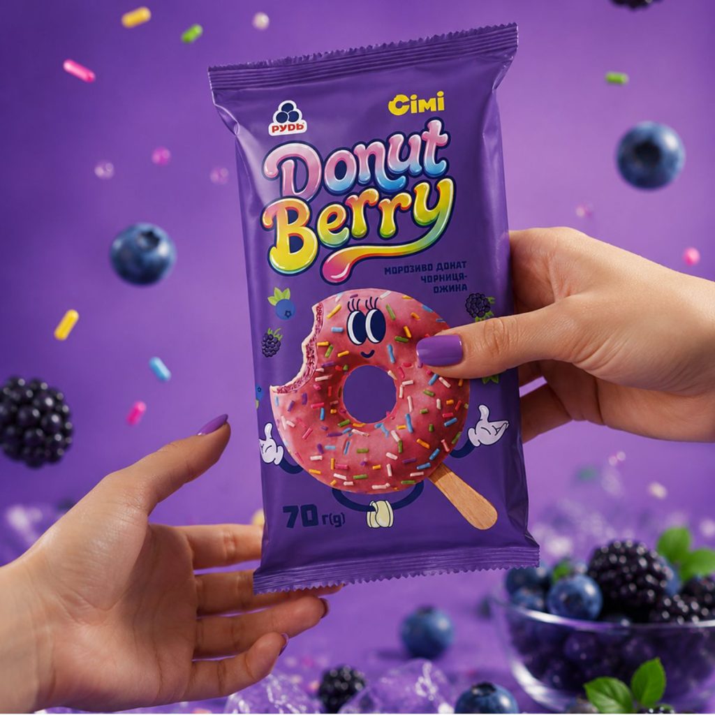
The Donut Berry title occupies a significant portion of the front panel. Rounded letters feature volume, shine, and color gradients reminiscent of glaze, fruit candies, and sugar decor. A dark outline separates the lettering from the purple background, maintaining readability despite the vibrant mix of shades.
“Donut” and “Berry” are styled differently. Pink, blue, and light tones dominate the first word, while the second starts in yellow, transitions through orange and green, and finishes with a long colorful flourish. This prevents the title from looking static; it feels playful, sweet, and exuberant—much like a sprinkle-covered dessert itself.
A brief descriptor is placed nearby: “blueberry-blackberry donut ice cream.” It was not assigned another large layout block or inflated into an advertising slogan. The packaging piques curiosity first, then quickly clarifies the category and flavor.
The lower-center area features the pink donut on a wooden stick. The glaze, multicolored sprinkles, round form, and a bitten edge exposing the inner layer are all clearly visible. The artwork remains close enough to real ice cream for consumers to immediately understand what is inside the wrapper.
Then comes the personality: large eyes, a smile, hands in white gloves, and tiny feet were added to the donut.
These details are few, but they transform the perception of the entire package. The ice cream becomes a character without losing its appetite appeal. A fully illustrated character might have drifted too far from the actual product, whereas plain product photography would have looked understated next to the bold, colorful title. Here, the photographic base delivers recognizable shape and texture, while the face and gloves add emotion.
The bitten edge proved equally effective. It reveals the interior layer, breaks up the perfect circular outline, and makes the image feel less staged. The donut appears actively involved in a story, even without a complex background plot or lengthy copy.
Decorative elements abound—berries, colorful sugar sticks, character hands, and small graphic accents surround the product. However, they do not carry equal visual weight. The eye reads the title first, followed by the donut, the flavor description, the logos, and finally the weight.
For a business looking to order packaging design, establishing this reading hierarchy is far more critical than the sheer volume of bright details. When every element is equally large and high-contrast, the packaging does not become more visible; it turns into a noisy blur where the eye finds no anchor point.
Why Purple Works Here
A rich purple background creates an immediate mental link to blueberries and blackberries before the consumer even reads the flavor text. It offers strong contrast against the pink ice cream coating, the yellow “Simi” logo, and the lighter letter forms in the title.
The surrounding berries reinforce this association. They were not styled into a formal, realistic composition with leaves and water droplets. Here, the berry flavor is communicated not through restrained naturalism, but through vibrancy, sweetness, and playfulness.
This direction aligns with the nature of the product itself. A donut-shaped ice cream with colorful sprinkles does not call for craft paper textures or quiet botanical artwork; a bolder visual language fits it best.
The Pouch in Hand
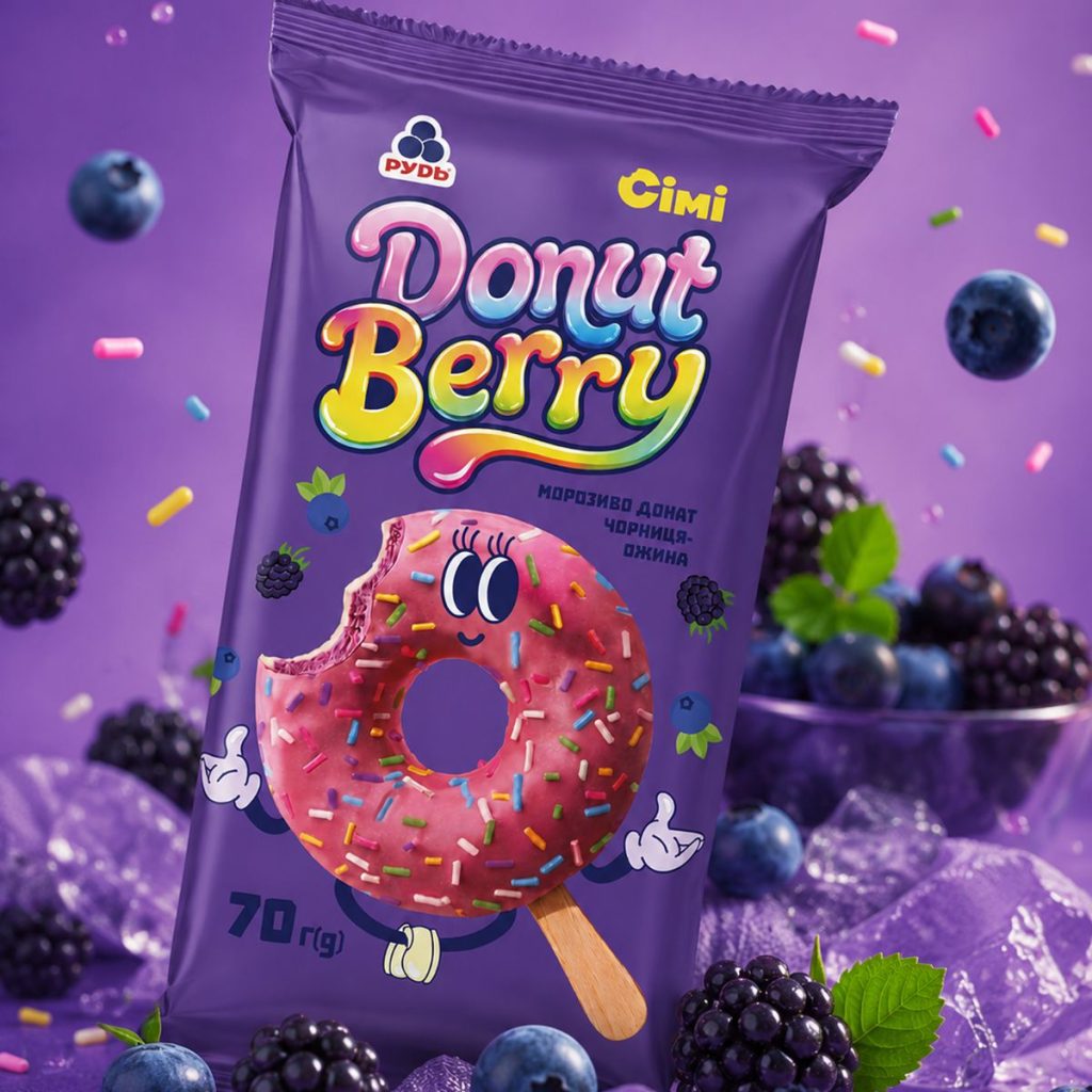
On a flat mockup, almost any layout appears neat. Flexible foil packaging behaves differently once manufactured: it bends, creases near seams, gets partially obscured by fingers, and shifts proportions depending on filling volume.
Real-life photography confirms that key Donut Berry elements remain within the central working zone. The title is not cramped against the top seal, the donut is not clipped by side seams, and the 70 g weight mark stays clear in the lower-left corner. Even when the pouch is held with both hands, the core visual remains fully readable.
The vertical pouch format supports the composition. The circular ice cream sits nearly centered, while the wooden stick directs the gaze downward. Without it, the large donut might have looked like a heavy, floating circle. The stick anchors the central image to the bottom of the pouch, adding direction to the entire structure.
The design avoids uniform density across zones. The top is denser due to logos and title copy, the middle stays active with flavor descriptors and the upper portion of the ice cream, while the bottom leaves breathing room around the stick and weight indication. This variation helps the layout feel dynamic and balanced.
A Unified Visual World for Packaging and Ads
Product photography extends the wrapper’s design language rather than introducing a conflicting style. The purple backdrop, blueberries, blackberries, ice, and scattered sprinkles feel like a natural continuation of the package artwork. Even out of the wrapper, the ice cream remains instantly identifiable with Donut Berry thanks to its shape, pink coating, and colorful decor.
This offers the project greater flexibility across communications. Campaigns can feature the bare product, the wrapper alone, or both together without losing visual recognition. For a seasonal release reliant on impulse buys and social media reach, such consistency is invaluable.
In the final design, Red&Ko avoided making the co-branding partnership itself the primary message. The collaboration remains clear, yet the focal point belongs to Donut Berry—its title, color scheme, and character.
The result is a packaging design that immediately conveys product shape, communicates flavor, and supports the lively spirit of a limited-edition release. Two logos, bold typography, berries, and a character do not assemble into a mechanical collection of elements; they form a cohesive image that stands out in a freezer display, an ad shot, or a social media feed.

