
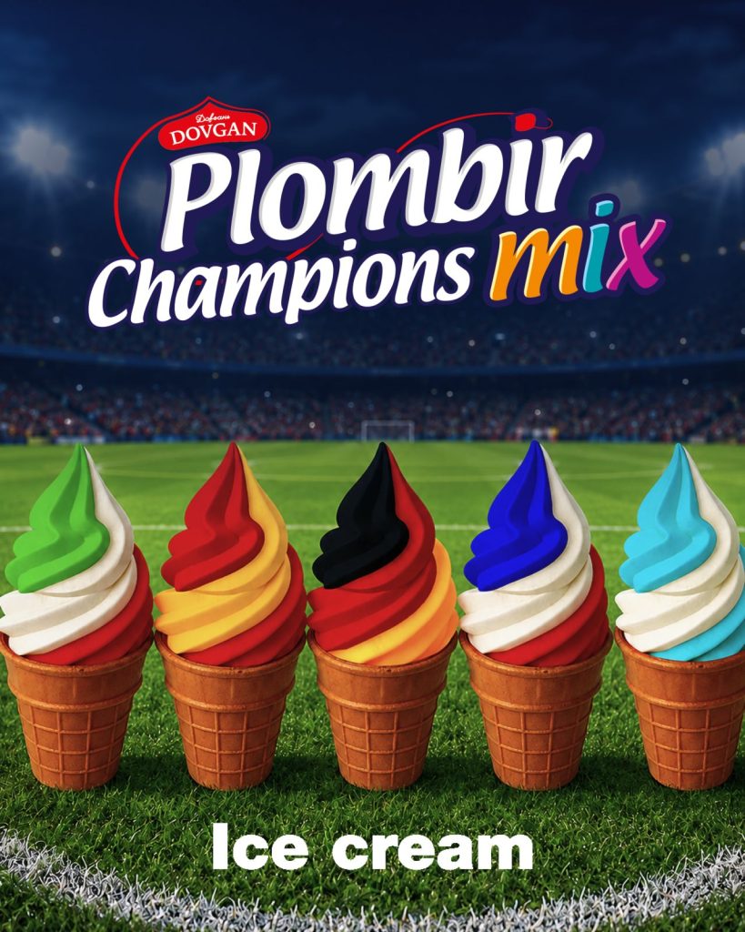
Product Packaging Design for an Event: When Football Season Becomes Part of the Pack
Major football tournaments function as a short but very loud window of opportunity for FMCG brands. People watch the matches, gather in groups, buy snacks, drinks, desserts, something “for the game” and “after the game.” During this period, even an ordinary product can gain additional emotional meaning, provided the brand doesn’t try to artificially attach football to the box, but truly builds it into the core idea.
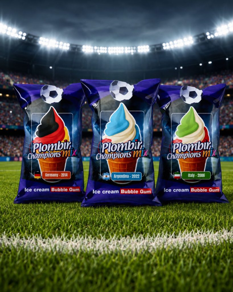
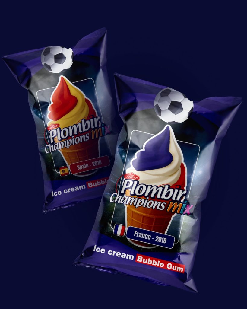
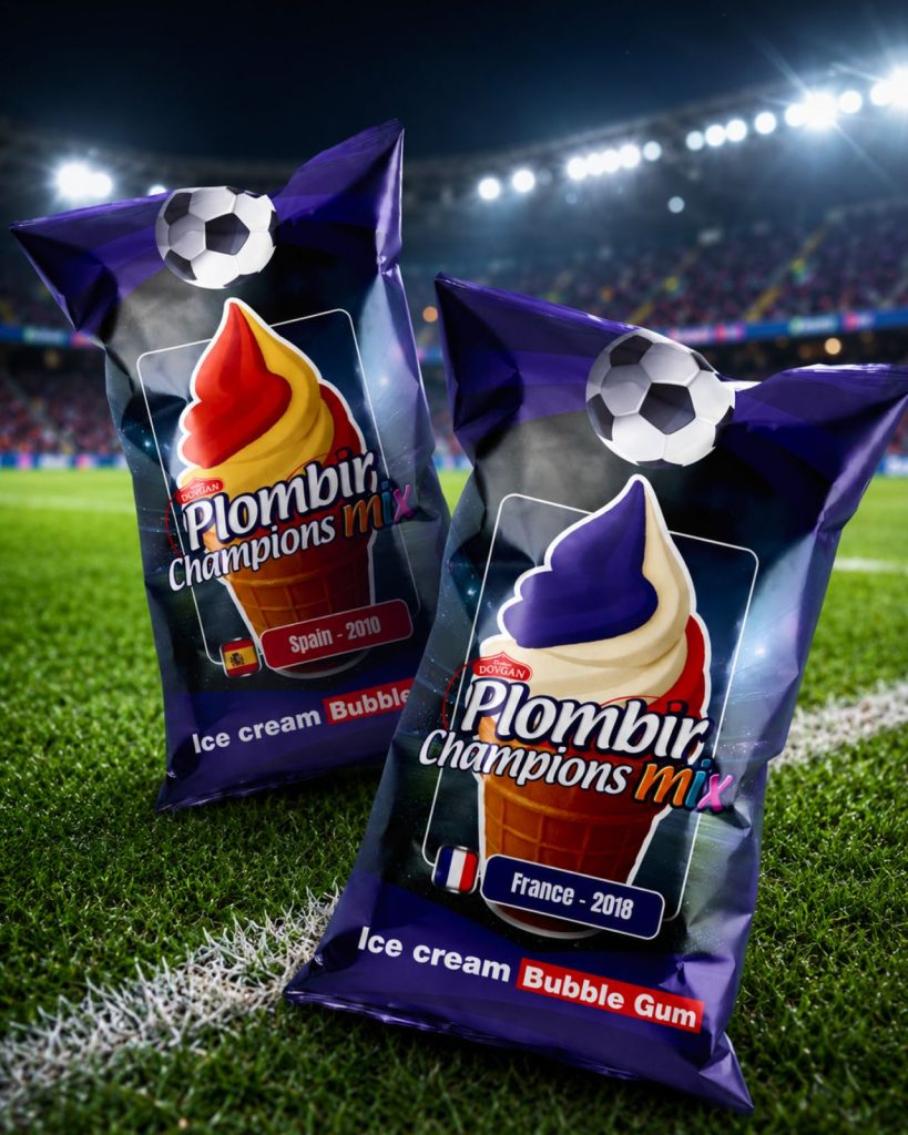
Plombir Champions Mix for the German market was built around this very logic. It is a limited edition ice cream series in waffle cups, where each variant features the colors of a national football team that has become a world champion. Italy, France, Germany, Spain, Argentina—this is not just geography on a label, but ready-made emotional codes for people who live for matches, memories of finals, and arguments about their favorite teams.
At first glance, the idea is simple. In reality, complexity hides within such simplicity. The goal was not to make “ice cream with a football,” but to assemble a series that looks like part of a massive sports season while still remaining an appetizing dessert, rather than a souvenir from a fan shop.
Football provides the emotion, but the packaging must sustain it
Seasonal products often fail due to one single mistake. A brand takes a powerful news hook but uses it too literally from a visual standpoint. It adds a ball, a flag, a couple of dynamic lines, and that’s where the story ends.
Plombir Champions Mix required more.
The colors of each team became the foundation of the product itself. The cone looks not just like plombir with toppings, but like a mini fan object that you want to compare with others. There is a playful element to it. A person might pick “Germany” because they support the national team, “Argentina” because they remember the final, or simply look for all the variants of the series in the freezer.
For the impulse-buy category, this mechanic is incredibly effective. It gives the consumer a reason to choose that goes beyond just taste.
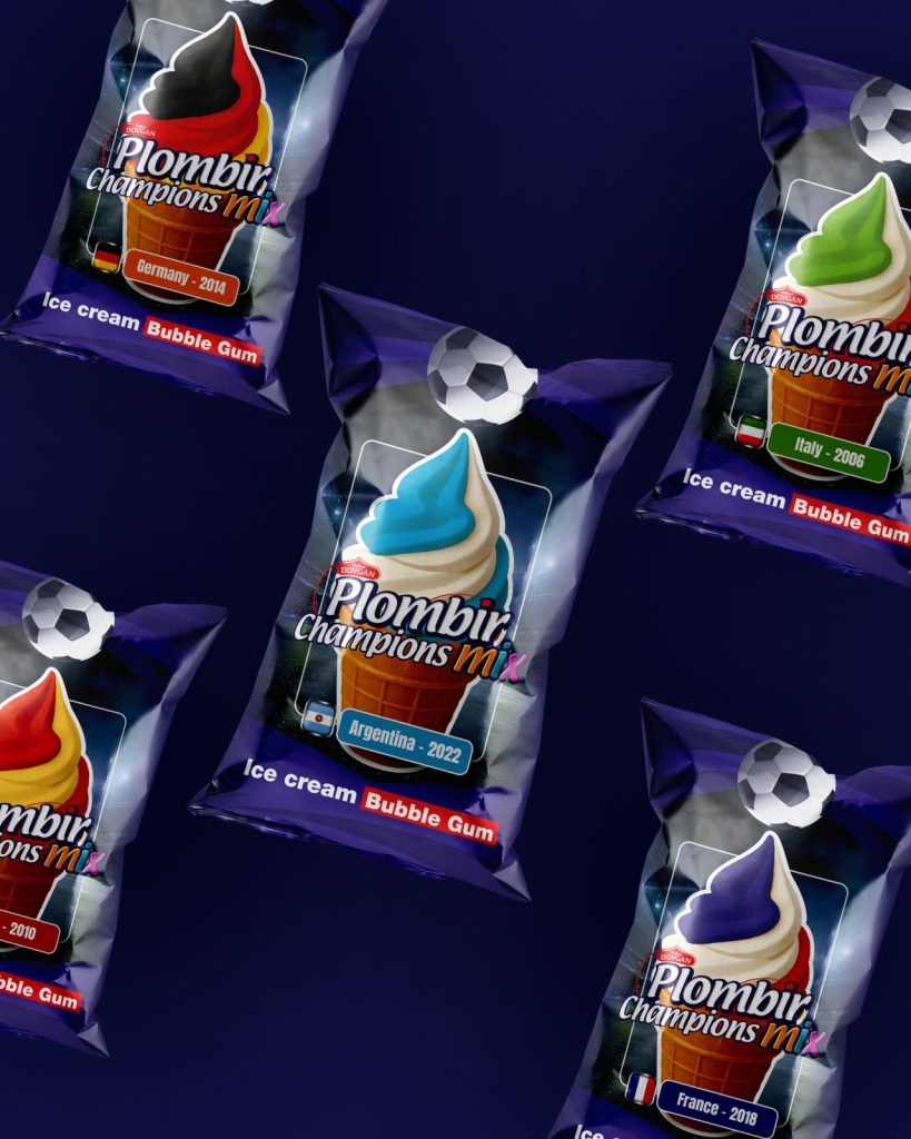
The freezer quickly strips the romance away from the mockup
On a render, everything looks pristine. The stadium, the bright cup, the ball, the neat typography. In a real store, the picture is much harsher.
The freezer display has its own optics: the glass reflects glare, the cold light shifts colors, promo stickers intrude into the frame, and neighboring packs crowd the graphics from all sides. The buyer doesn’t examine the design like an art director at a presentation. They open the freezer door, their hand gets cold, and they make a decision very quickly.
Because of this, the stadium background in Plombir Champions Mix works not as a decoration, but as a dark stage for the product. The colored cones are easily readable against it, the football immediately sets the theme, and the series itself holds together even when multiple packages are visible next to each other in the freezer.
This is one of those situations where developing a packaging design must account not only for “how beautiful it looks,” but also “how to survive the chaos of a real shelf.”
The main competitor isn’t always standing next to you
In retail, it’s easy to think that a product is fighting against other brands. To some extent, it is. But for seasonal products, the main enemy is often different: indifference.
A buyer might see a new product and feel absolutely nothing. They just walk on past. Not because the product is bad, but because it didn’t give them a reason to stop.
The football series works differently. It triggers a small internal reaction: familiar colors, a stadium, a national team, a championship context. It is no longer just “another cup of plombir.” It becomes an object to discuss, to grab for a match viewing, to take a picture of, or to buy for a child saying, “Look, this one has the colors of Spain.”
In product marketing, these micro-reactions are often more important than lengthy advertising explanations.
The lineup must be ready for growth
Creating a standalone mockup is easier than designing a system. One flavor, one country, one beautiful box, and everything looks convincing. The problems begin when the series expands.
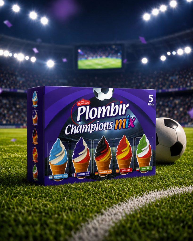
Plombir Champions Mix features a clear architecture: the background, the logic of product placement, the sports graphics, the country zone, and the national team colors. This allows for new variants to be added without making it feel like each design lives in isolation.
For a brand, this structure saves a lot of stress down the road. If a new tournament, a new champion, or a special promo series comes up, there is no need to reinvent the wheel. It’s enough to work within the already established visual system.
This isn’t about one pretty label. It’s about branding that can withstand multiple seasons and won’t fall apart after the third SKU.
A seasonal series must perform beyond just the store
Strong packaging hasn’t lived solely on the shelf for a long time. It is seen in short videos, banners, stories, marketplace catalogs, and promotional materials for retail chains. If a concept relies entirely on a single front-facing mockup, it quickly loses its power in digital spaces.
The football theme in Plombir Champions Mix translates beautifully into advertising. The national team colors can be utilized in banners, the cones easily turn into the heroes of promotional visuals, and the stadium background offers a ready-made atmosphere for short videos. Such a system removes the need to invent a new style for every medium each time.
For FMCG, this is a practical advantage. Creative ads, POS materials, the promo page, and the packaging all speak the same language. The buyer doesn’t get the feeling that the advertisement promises one thing while the box in the store looks completely different.
The football theme must not consume the product
In projects like this, it is easy to get carried away with the sporting aspect. Adding more balls, more flags, more stadium noise. But ice cream must remain ice cream. A person is buying a dessert, not a championship poster.
Therefore, the national team colors in the series work in tandem with appetite appeal. The cone is large, rich, and highly visible. The sports background enhances the idea but doesn’t steal the spotlight from the product.
This balance is crucial for any seasonal packaging. If the event completely overshadows the goods, the product quickly loses relevance once the season ends. If the event is poorly integrated, the series looks like a generic design with a random decorative theme.
The middle ground works perfectly here: the product remains in focus, while football provides the reason to buy.
When is it worth launching seasonal packaging?
Not every holiday and not every news hook deserves a dedicated series. If an event holds no emotional weight for the audience, it is better not to waste resources on temporary designs.
With football tournaments, the situation is different. The matches create a shared rhythm for millions of people. The brand doesn’t need to explain why this matters. It simply enters an already established atmosphere, but it must do so carefully, without forced fan grandiosity.
Before launching a series like this, it’s worth checking a few things:
- is the idea understandable without explanation within one or two seconds;
- is the brand visible in the freezer among competitors;
- can new SKUs be added without a complete redesign;
- does the concept work in advertising, social media, and marketplaces;
- will the product remain interesting after the tournament ends.
If the answers are weak, the problem lies neither in the recipe nor in the promotion budget. Most often, the visual system itself simply fails to hold up.
Seasonal design as a tool, not an ornament
Plombir Champions Mix illustrates perfectly how a major event can transform the perception of a familiar FMCG product. Ice cream doesn’t need a complex backstory. It needs a clear occasion, a strong visual logic, and packaging that stands out in a real retail environment.
In such case studies, ordering packaging design means more than just getting a pretty mockup for the season. It is about developing a system that connects the product, the emotion, the shelf, digital spaces, and the future expansion of the lineup.
When this works, an ordinary dessert begins to live in the rhythm of a football tournament. It is bought not just for the taste, but for the moment, the company, the match, and the mood. For a brand, this is an entirely different level of consumer engagement.

