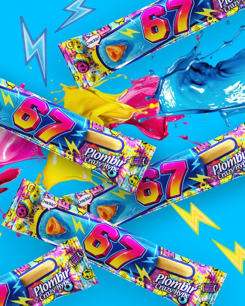
Package and Label Design
Label and packaging design: when a product gains a clear identity
In good packaging, there are rarely accidental elements. The name, logo, color, product photo, flavor, and technical information must all carry their own weight. If everything is made prominent at once, the buyer does not see more information, but more noise.
That is why label and packaging design at Red&Ko is built around how the product will be perceived in a real-world environment. For one product, a large object-focused image might be the key; for another, distinctive typography or a color code that helps quickly identify the desired flavor within a product line.
A label works on a physical shape, not on a blank sheet
A flat layout is easy to make neat. Once transferred onto a bottle, can, box, or flexible pouch, the situation changes: part of the composition shifts sideways, the surface curves, and seams, edges, and zones appear that the customer sees only from a certain angle.
Because of this, it is crucial not just to place the name nicely, but to verify whether it remains readable on the actual container. The same applies to flavor, weight, and the primary visual asset.
Another key consideration is the product line. If five more items are added to a single product tomorrow, the visual system must handle the expansion without requiring a complete redesign of every SKU.
What remains after the first glance
Strong design does not require a lengthy explanation. The shopper understands the product category, spots the brand name, notices the distinction of a specific variant, and can quickly navigate to the details.
This is precisely the practical role of label and packaging design: not merely to decorate a surface, but to organize the product visually. Red&Ko approaches composition, typography, color, and information hierarchy as an integrated system that stays cohesive both on the retail shelf and in an online product listing.