Creative packaging design

Order Creative Packaging Design: Giving Your Product a Distinct Visual Identity

Creativity in packaging is never measured by the sheer volume of colors, illustrations, or eccentric typefaces. It is far more critical to discover a visual technique that genuinely fits the product and sets it apart at a glance. This core principle drives Red&Ko’s approach to creative packaging design.

When a brand decides to order creative packaging design, the artwork faces a clear, practical challenge: establishing a distinct product personality without making it difficult to understand.

One Powerful Focal Point Over Ten Weak Accents

A front panel does not need to push the brand mark, product title, description, flavor, and promotional callouts with equal volume. Secondary details can remain understated, allowing the primary visual anchor room to breathe.

This key focal point might be an oversized product name, high-impact product photography, a character, bold typography, or an expressive block of color. The decision is always driven by the product itself—never by a superficial urge to make something “creative” at all costs.

Informational discipline is equally essential. A consumer must instantly understand what the product is before taking the time to explore finer details.

Translating Creative Concepts to Physical Shapes

A flat 2D layout can easily hold a bold composition, but a physical bottle, folding carton, or flexible pouch will reshape it. Typography wraps around side panels, artwork bends over contour lines, and certain elements disappear from direct front-facing view.

That is why Red&Ko evaluates packaging design not as an isolated poster, but as dynamic graphics mapped to a specific container shape.

For product lines, another standard applies: individual SKUs need clear differentiator cues while preserving unified brand equity. Color accents, flavor iconography, or distinct photography can shift while the core compositional framework remains unmistakably recognizable.

Choosing to order creative packaging design is about much more than securing an eye-catching graphic. A complete design system must perform flawlessly on physical packaging, retain readability at thumbnail scale, and claim a distinct visual territory for the product.

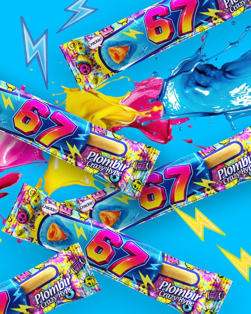
Product packaging design: the creative case study of "67" ice cream. | Red&Ko

Product packaging design: the creative case study of “67” ice cream.

Product packaging design: how controlled chaos sells ice cream. When packaging works louder than advertising: why “67” ice cream is remembered at first sight! Ice cream packaging has very little time to catch the buyer’s eye. A person opens the freezer, quickly scans dozens of labels, and almost immediately decides what to take. This is […]

Product packaging design: the creative case study of “67” ice cream. Read More »

, , , , , ,
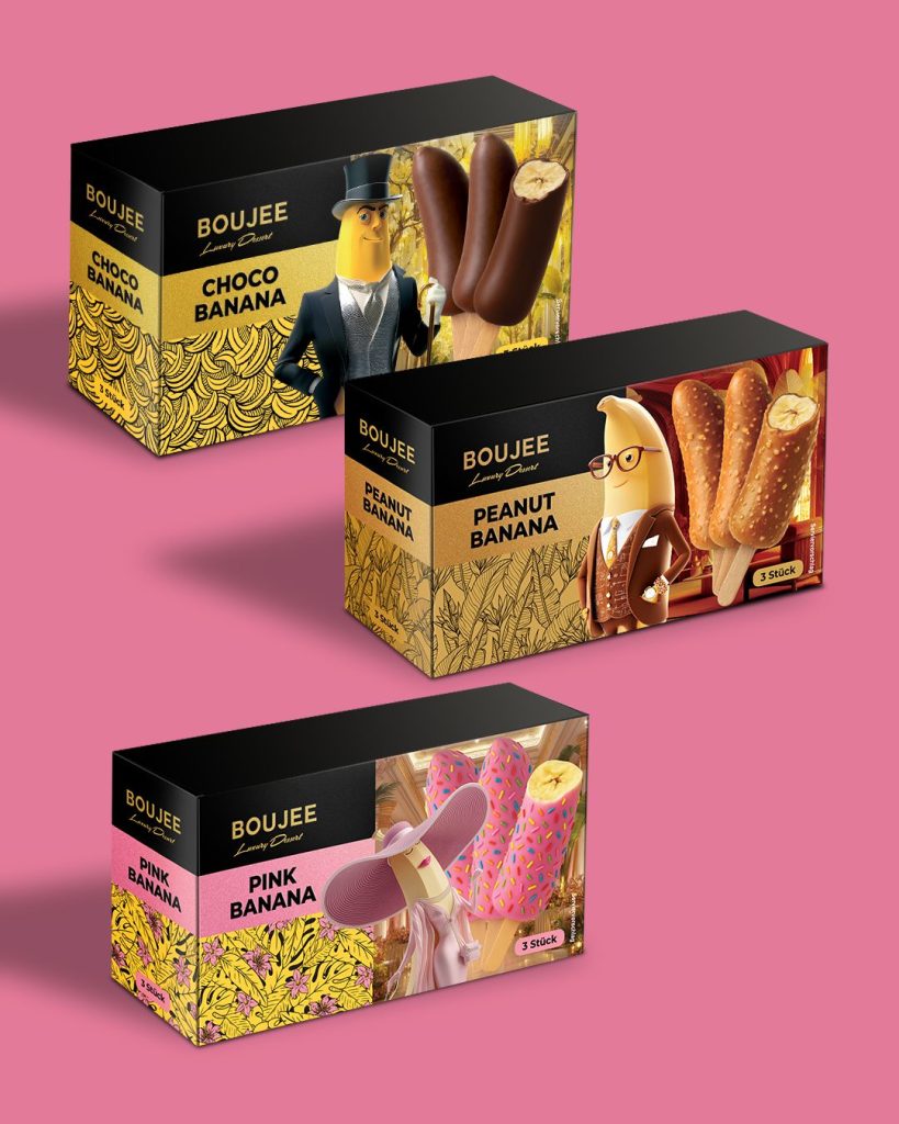
Product packaging design: how characters sell a frozen dessert | Red&Ko

Product packaging design: how characters sell a frozen dessert

When a simple dessert suddenly starts acting like a premium product A glazed banana on a stick sounds as simple as it gets. A person sees a freezer, dozens of boxes, a familiar dessert, and makes a decision in literally a few seconds. In this category, a product either hooks you immediately or simply disappears

Product packaging design: how characters sell a frozen dessert Read More »

, , , , , ,
DOCHI product packaging design: how to change the perception of a dessert | Red&Ko

DOCHI product packaging design: how to change the perception of a dessert

DOCHI product packaging design: when a dessert changes the visual scenario DOCHI, a dessert in the format of a soft pastry with a filling. There are categories that remain in a familiar visual scenario for a long time. Desserts, pastries, and sweets often look the same. Soft colors, predictable photos, classic fonts. And it is

DOCHI product packaging design: how to change the perception of a dessert Read More »

, , , , , ,
EscapeWelt product packaging design: from logic to game. | Red&Ko

EscapeWelt product packaging design: from logic to game.

EscapeWelt product packaging design: how to convey meaning through form There are products that don’t sell at first glance, even if they are of high quality. This is especially noticeable in the logic games category. Wooden puzzles look beautiful in your hands, but on the shelf, they often get lost among boxes that promise nothing.

EscapeWelt product packaging design: from logic to game. Read More »

, , , , , , , ,
Galicia product packaging design: how visual becomes action | Red&Ko

Galicia product packaging design: how visual becomes action

Product packaging design as an action tool: the Galicia Carrot Rocket case There are projects where the product speaks of taste. There are those where the packaging speaks. And there are rare cases when the packaging becomes a part of the action. The image shows exactly such a case. This is a 200 ml Galicia

Galicia product packaging design: how visual becomes action Read More »

, , , , ,
Product packaging design: how to create a taste that is visible even before purchase? | Red&Ko

Product packaging design: how to create a taste that is visible even before purchase?

Sweets are not always sold through taste. Often, everything is decided even before the packaging gets into your hands. On the ice cream shelf, the buyer does not read the ingredients, does not look for the brand history, does not analyze. They just look. And make a choice in a few seconds. The image shows

Product packaging design: how to create a taste that is visible even before purchase? Read More »

, , , , ,
Freeze Dried Ice Cream - When packaging turns a new product into a story! | Red&Ko

Freeze Dried Ice Cream – When packaging turns a new product into a story!

Sometimes a product lands on the team’s desk even before a name, an advertising campaign, or an exhibition stand appears. There is a prototype on the desk, along with a few questions. How do we make a person want to try this dessert, even if they have never heard of it? How do we create

Freeze Dried Ice Cream – When packaging turns a new product into a story! Read More »

, , , ,

mini mochi – When a dessert must look desirable even before the first bite

When a dessert must look desirable even before the first bite On supermarket shelves, desserts live in a very fast rhythm. A person walks past the refrigerated case, their gaze sliding over dozens of packages, and only a few of them truly grab their attention. The decision happens instantly. And often it depends not on

mini mochi – When a dessert must look desirable even before the first bite Read More »

, , , , , , , , , , ,

Hot Scorpion Packaging Design – When packaging conveys heat even before the first bite

When packaging conveys heat even before the first bite On the supermarket shelf, there are products that don’t try to look restrained. They immediately declare their character. Spicy snacks belong exactly to such categories. A person looking for such a product expects not just a taste, but a certain experience. The images clearly show that

Hot Scorpion Packaging Design – When packaging conveys heat even before the first bite Read More »

, , , , , , , , ,

Delice Napoleon Packaging Design – When a Classic Dessert Enters a New Market

When a Classic Dessert Enters a New Market Sometimes, a product launch doesn’t start with the recipe. It already exists, is time-tested, and is well-known to customers. The challenge arises a bit later, when the brand enters a new market. What looks familiar in one country may look completely different on the shelf of another.

Delice Napoleon Packaging Design – When a Classic Dessert Enters a New Market Read More »

, , , , , , , , , ,