Packaging Design Ice Cream

When unique packaging helps highlight ice cream

Ice cream is an impulse buy. A person opens the freezer, sees dozens of cones, cups, and bars, and quickly chooses a familiar brand or a product they can understand in a matter of seconds. Unique packaging only helps if it doesn’t hide the flavor, format, and key product benefit.

Show what’s inside first

Ice cream packaging design is often overloaded with decorative waves, milk splashes, and oversized lettering. This leaves little room on the front panel for the product itself. The shopper sees a pretty package but can’t tell whether it contains classic ice cream, a popsicle, an ice cream sandwich, or a filled bar.

A clear cross-section, visible texture, and true-to-scale portion size work best. If the product features a chocolate shell, nuts, or cookies, these details should be readable without needing fine print explanations.

The freezer changes the layout

Cold light dulls cream shades, glossy film creates glare, and frost partially obscures text. Because of this, ice cream packaging design is tested on more than just a large digital mockup. At Red&Ko, layouts are evaluated at actual size, side-by-side with competitors, and through photos taken through freezer glass.

A pale blue background might disappear among neighboring packs. Vibrant turquoise, yellow, or purple creates a noticeable splash of color without clashing with the product photography.

Creativity must handle line expansion

A single flavor is easy to style with an isolated idea. For six or eight SKUs, you need a system where color, name, or key ingredients change while the logo, composition, and brand character remain consistent.

It’s best to order ice cream packaging design before finalizing the choice of film, cup, or box. That way, you can still account for seams, gluing zones, printing constraints, and retail network specifications.

Unique packaging doesn’t rely on a stack of effects. It clearly reveals the product, stimulates appetite, and helps shoppers recognize the brand on their next purchase.

Product Packaging Design for Sandwich Ice Cream: Nicee Case Study | Red&Ko

Product Packaging Design for Sandwich Ice Cream: Nicee Case Study

Dessert Packaging Design Development: Ice Cream Between Cookies: When a Simple Dessert Requires Highly Precise Presentation There is one tricky thing about ice cream. If the product is straightforward, it seems that the packaging will be easy too. The buyer already knows what cookies, plombir, chocolate filling, and milk are. Yet, simple products get lost […]

Product Packaging Design for Sandwich Ice Cream: Nicee Case Study Read More »

, , , , ,
Product Packaging Design for a Seasonal FMCG Brand | Red&Ko

Product Packaging Design for a Seasonal FMCG Brand

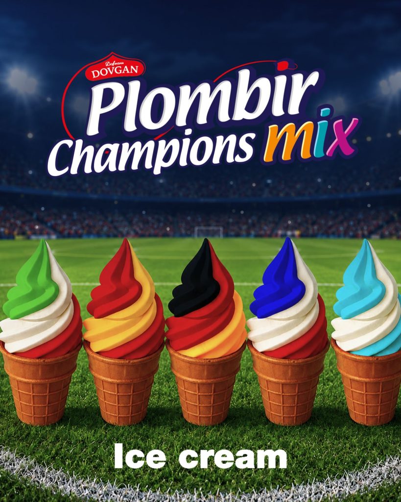
Product Packaging Design for an Event: When Football Season Becomes Part of the Pack Major football tournaments function as a short but very loud window of opportunity for FMCG brands. People watch the matches, gather in groups, buy snacks, drinks, desserts, something “for the game” and “after the game.” During this period, even an ordinary

Product Packaging Design for a Seasonal FMCG Brand Read More »

, ,
Product packaging design: Burger ice cream case study | Red&Ko

Product packaging design: Burger ice cream case study

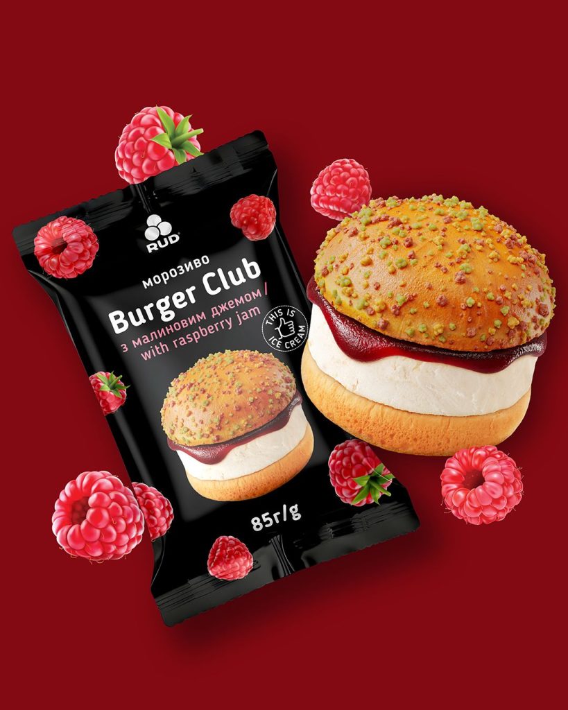
Product packaging design: Burger ice cream case study by the “Rud” company Burger-shaped ice cream – when the packaging supports the product’s character. In product design, there is a category of ideas that look very bold in a presentation but start causing problems in real retail. The Burger ice cream by “Rud” belongs to exactly

Product packaging design: Burger ice cream case study Read More »

, , , , ,

mini mochi – When a dessert must look desirable even before the first bite

When a dessert must look desirable even before the first bite On supermarket shelves, desserts live in a very fast rhythm. A person walks past the refrigerated case, their gaze sliding over dozens of packages, and only a few of them truly grab their attention. The decision happens instantly. And often it depends not on

mini mochi – When a dessert must look desirable even before the first bite Read More »

, , , , , , , , , , ,

Packaging Design – “Juicy Trilogy.” Ice Cream as a Blockbuster on the Shelf.

There are products sold through rational arguments. There are those that work through emotion. Ice cream almost always belongs to the second category. A person approaches the supermarket freezer not just for the taste. The choice often begins with color, mood, and the story conveyed by the packaging. This was exactly the approach used to

Packaging Design – “Juicy Trilogy.” Ice Cream as a Blockbuster on the Shelf. Read More »

, , , , , , , , ,