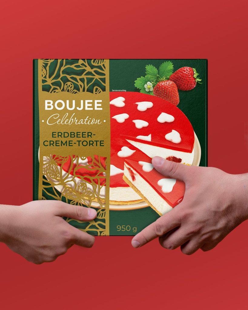
Food Packaging Design
Food Product Design: From Flavor to a Clear Identity on the Shelf.
In the food category, the consumer almost always sees the packaging before the product itself. It is the packaging that provides the first cues about flavor, texture, format, and product character. That is why food product design is not just about choosing a color palette or placing an attractive photo on the front panel.
At Red&Ko, packaging design is approached as a cohesive system. The product name, logo, typography, key visuals, flavor indicators, and regulatory information must follow a clear hierarchy. When every element screams for attention, the packaging loses its primary focus.
The product must remain the hero
For ice cream, it is essential to showcase texture and richness. A sauce requires a different approach, while a beverage calls for another entirely. In some cases, a single prominent hero ingredient is sufficient; in others, showing a cross-section helps communicate the product’s internal structure.
Commercial product photography serves a very specific purpose in this type of design. It does not merely fill empty space. A well-crafted shot communicates the density of chocolate, the filling of a pastry, a crispy texture, or the vibrant tone of a drink far faster than any descriptive copy can.
Color also works in tandem with the product itself. A pistachio green naturally reinforces nutty notes, while a berry purple evokes an entirely different set of associations. However, the chosen palette must always maintain strong contrast for product titles and critical information.
When a product line emerges
A single standalone package can act as a distinct design piece. A product range, however, demands a structured set of rules.
Consumers must easily distinguish strawberry from chocolate or pistachio while instantly recognizing that all items belong to the same brand family. Typically, the overarching layout framework remains fixed, while color coding, photography, or specific graphic accents handle flavor navigation.
This is where food product design transitions from styling a single SKU to architecting a scalable visual system that accommodates range expansion without losing brand recognition.
The physical container is equally important. Labels curve around bottles, flexible pouches develop folds and wrinkles, and folding cartons present multiple visible facets. What looks balanced on a flat screen layout must always be evaluated on the actual physical form factor.
For Red&Ko, food product design is not about creating isolated visuals, but shaping how the product is encountered by the consumer. Strong design does not attempt to convey everything at once. It guides the eye to what matters most, ensures instant comprehension, and allows the consumer to explore the finer details naturally.