Order Custom Packaging Design
Custom Packaging Design – When a Product Needs Its Own Visual System
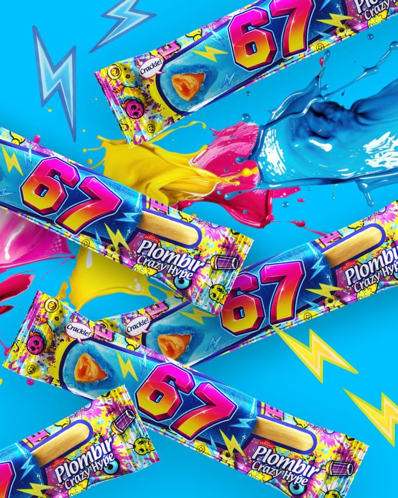
Custom packaging design makes sense when a product cannot simply be dropped into a generic template with a swapped title. Different categories require different approaches: for ice cream, flavor and hero product visuals are paramount; for beverages, the container shape and label carry more weight; for a product line, seamless navigation between individual SKUs is essential.
At Red&Ko, packaging design is tailored specifically to the product. We first identify what the customer should register first: the brand, product name, format, flavor, or a distinctive visual asset. Only then do we construct the front-panel composition.
Color and Typography Do Not Exist in Isolation
Even the strongest color palette provides little value if the product name blends into the background or a photograph overpowers key information. Conversely, a restrained color system can be remarkably impactful when focal points are executed correctly.
Typography also depends heavily on the product. A bold, expressive typeface is not appropriate for every category. Some products require a more understated hierarchy where the brand mark is read first, followed by the category, and then the specific flavor or variant.
A truly custom approach is defined by these strategic decisions rather than an abundance of decorative details.
Packaging Must Hold Up on the Physical Container
A flat 2D layout reveals only part of the equation. Once applied to a bottle, box, jar, or flexible pouch, the composition shifts. Graphic elements curve around edges, surfaces bend, and seams or technical zones come into play.
That is why when ordering custom packaging design, it is vital to look beyond the flat front artwork. The brand name must remain legible, the key visual must avoid unwanted fold lines, and mandatory information needs dedicated, uncluttered placement.
Planning for Range Expansion
Designing a single SKU allows for creative freedom, but an entire series demands structured rules.
Red&Ko approaches packaging as a scalable system where anchor elements remain consistent while dynamic variables adapt to flavor, variety, or volume. This allows new SKUs to be introduced seamlessly without reinventing the design language each time.
Strong custom packaging design never makes a product unnecessarily complicated. It eliminates visual clutter, amplifies what matters most, and builds an identity that translates effortlessly from packaging to ad layouts, catalogs, and sales decks.